This mistake cost me 700+ leads
I spent 2 weeks perfecting that landing page for the brand engine course.
Pixel-perfect design.
Punchy copy.
Even threw in a "founder story" section because some guru on YouTube said it builds trust.
I hit publish.
Posted the link everywhere. Then waited for magic.
Nothing happened. Literally noting.
People were visiting the page. But not clicking. Not converting. And I couldn't figure out why.
That night, I made my girlfriend read it.
She opened the page. Scrolled fast. Paused at the headline. Read the subheading. Then skimmed the first sentence of every paragraph.
Stopped halfway. Looked at me and said, "It looks nice... but I don't know what I'm supposed to do here."
Dagger.
But she was right.
See, I believed a lie. I thought if the content is good, people will read it. Turns out?
People don't read. They scan.

Their eyes follow a shape, something called the F-pattern. (just google it)
Line across the top. Shorter line underneath. Then a vertical skim down the left. If you don't design for this pattern?
Your content becomes invisible. No matter how great it is.
Here's the brutal truth:
You don't have your reader's attention. You have their suspicion.
They want to know, "Is this worth my time?"
So they scan the first line of every section , and maybe the first few words of every sentence, looking for gold.
If you bury your best idea in the middle? They'll never find it. If your call to action is floating in a wall of text? They'll scroll right past it.
That's why designing for the F-pattern isn't "nice to have."
It's survival.
Especially if you write newsletters, sales pages, or run a business online.
You need to frontload value .
You need to use layout like a weapon.
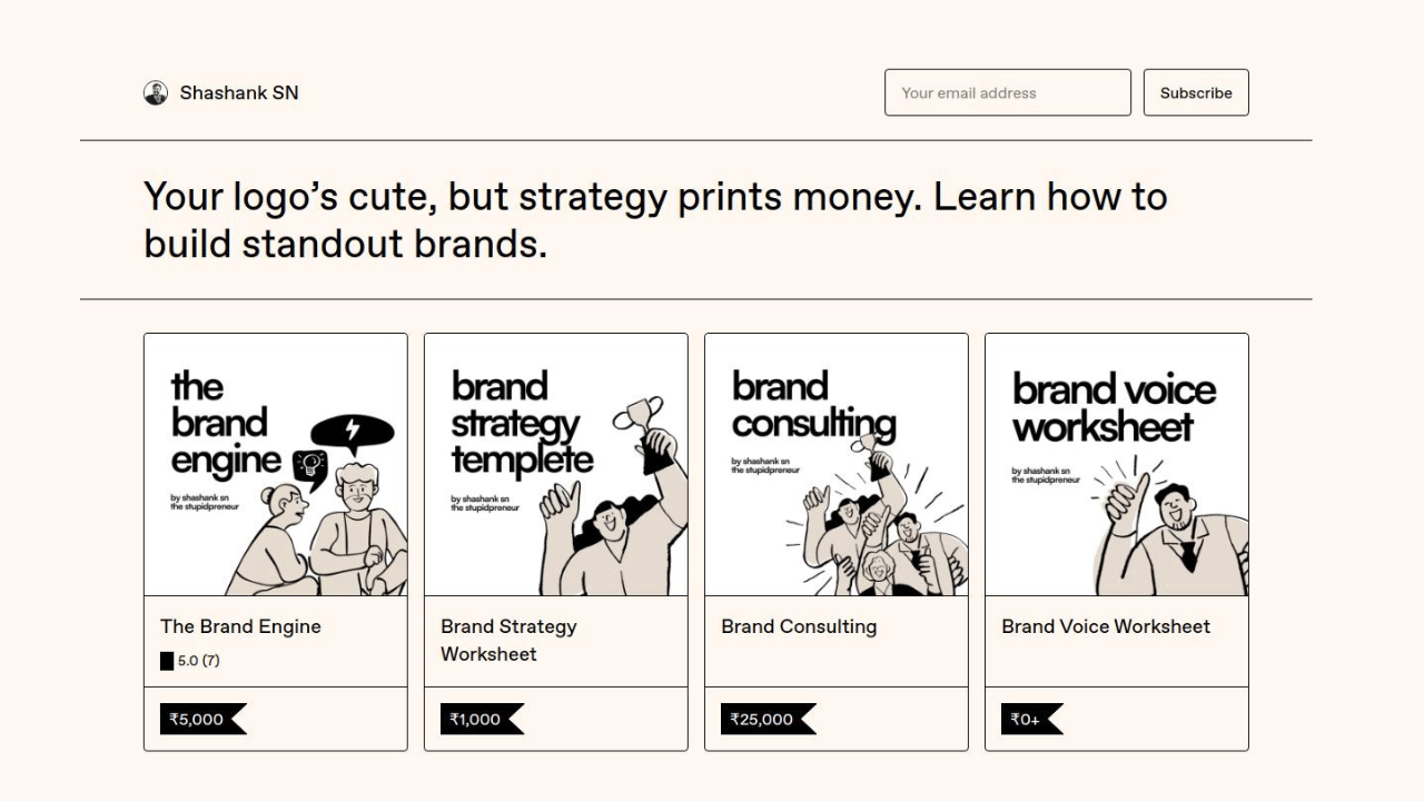
Here's how I fixed mine:
- Big headline. One idea. Strong contrast.
- Short subhead. Explains the benefit, not the product.
- Bullet points early. They catch the vertical scan.
- Short paras. One or two lines max.
- Left alignment. No center-aligned fluff.
- One CTA. High up. Bold. Clear.
No fancy tricks. Just better reading rhythm. And here is the landing page for The Brand Engine now.
We often try to "wow" readers with visuals. But in a noisy world, clarity wins. And clarity isn't just in what you say --- it's in where you place it.
Design is how your words are heard. Structure is how your brand is remembered. And if your brand feels too hard to read?
People will assume it's too hard to trust.
Design for the scan, not the scroll. Your job isn't to keep people on the page. It's to help them get what they need --- fast.
Because the faster they "get it," the more likely they are to act.
P.S. Got a buddy who'd appreciate this? Forward the email.
Found this in your inbox by surprise? You can signup right here!
Marketing ideas for marketers who hate boring

The best marketing ideas come from marketers who live it. That's what The Marketing Millennials delivers: real insights, fresh takes, and no fluff. Written by Daniel Murray, a marketer who knows what works, this newsletter cuts through the noise so you can stop guessing and start winning. Subscribe and level up your marketing game.
11, PNR Nagar
Dindigul, Tamil Nadu 624001, India

No comments yet. Be the first to comment!